
Showing posts with label signage. Show all posts
Showing posts with label signage. Show all posts
Sunday's Signpost

Sunday's Signpost


A self-proclaimed "experiential faux pas"
From a reader who will remain anonymous:
"Yes, I know your eight steps.
Yes, I know this is bad, bad museum practice... bad practice in general for any business anywhere.

But it's Memorial Day. I don't have enough staff and volunteers to watch these areas and I'm tired of walking through every hour (if I get a chance) and asking people to get out of the water.

Our printer is not working and there's no chance of getting it repaired. Our phones are out so I cannot call another department to use their printer—and they're all out on holiday anyway.
And so I commit the sin. I hand-write the signs and put them up.
At this point it's about MY experience not theirs!"
Dear reader, thanks for sharing. We've all been there, believe me. And I know that visitors will do the craziest things in gardens.
When I look at these signs, (nice handwriting, by the way) my first thought is: this is a design problem. Because the area is an experiential garden, and there are lots of things to touch (and probably things meant to climb) and so it's confusing for the visitors to know which things are off-limits. I'm wondering if there could have been ways to design this to either create clearer barriers or allow the kind of climbing and wading that visitors clearly want to do.
Any designers out there want to comment, for people who are still in the building or planning stage?
Technorati Tags: customer experience, customer service, signage, museum, visitor experience, consultant
"Yes, I know your eight steps.
Yes, I know this is bad, bad museum practice... bad practice in general for any business anywhere.

But it's Memorial Day. I don't have enough staff and volunteers to watch these areas and I'm tired of walking through every hour (if I get a chance) and asking people to get out of the water.

Our printer is not working and there's no chance of getting it repaired. Our phones are out so I cannot call another department to use their printer—and they're all out on holiday anyway.
And so I commit the sin. I hand-write the signs and put them up.
At this point it's about MY experience not theirs!"
Dear reader, thanks for sharing. We've all been there, believe me. And I know that visitors will do the craziest things in gardens.
When I look at these signs, (nice handwriting, by the way) my first thought is: this is a design problem. Because the area is an experiential garden, and there are lots of things to touch (and probably things meant to climb) and so it's confusing for the visitors to know which things are off-limits. I'm wondering if there could have been ways to design this to either create clearer barriers or allow the kind of climbing and wading that visitors clearly want to do.
Any designers out there want to comment, for people who are still in the building or planning stage?
Technorati Tags: customer experience, customer service, signage, museum, visitor experience, consultant
What's broken about this sign?
Mark Hurst of Good Experience hosts a hilarious blog called This Is Broken. This sign that I spotted in a radiology office definitely applies.
This particular office was remodeled in the last year and the designers/architects did a beautiful job. Lovely finishes and fabrics, much nicer check-in windows, and all the interior signs beautifully coordinated. [Note: The sign I'm about to show you was installed with a nice stanchion, a bit of a distance from the check-in windows. This is to meet patient privacy laws in the U.S.]
Then I went back. Uh-oh.

What happened here? My guess is that the sign (as designed) was too small to catch patients' attention, so they were walking past it up to the windows. So, out comes the old sign that was never thrown away, some clear packing tape and, voila!, problem solved. (This fix-it approach happened at my grocery store, too. See here.)
Tip of the day: How to solve problems like these? Test out sign size and placement as part of the design phase, and build in some prototyping time and money for fixes like these.
Technorati Tags: customer experience, signage, prototyping
This particular office was remodeled in the last year and the designers/architects did a beautiful job. Lovely finishes and fabrics, much nicer check-in windows, and all the interior signs beautifully coordinated. [Note: The sign I'm about to show you was installed with a nice stanchion, a bit of a distance from the check-in windows. This is to meet patient privacy laws in the U.S.]
Then I went back. Uh-oh.

What happened here? My guess is that the sign (as designed) was too small to catch patients' attention, so they were walking past it up to the windows. So, out comes the old sign that was never thrown away, some clear packing tape and, voila!, problem solved. (This fix-it approach happened at my grocery store, too. See here.)
Tip of the day: How to solve problems like these? Test out sign size and placement as part of the design phase, and build in some prototyping time and money for fixes like these.
Technorati Tags: customer experience, signage, prototyping
What a hand-written sign can tell you
Recently spotted in my large chain grocery store: "Butter. Over here."

Hand-written signs tell you several things:
-An employee has taken it upon himself or herself to fix a problem.
-Customers are repeatedly asking for something and not finding it.
-Someone made a design or placement decision without talking to front-line staff people first.
Usually, the problem isn't fixed by adding a sign.
Tip of the day: Search your site for hand-made signs. Sit down with front-line staff to discuss the problem that the sign represents. Reward them for taking initiative. Decide as a group how best to fix the problem. If a sign is still needed, make something permanent that fits the rest of your brand communication.
Technorati Tags: customer experience, customer service, signage, museum, visitor experience

Hand-written signs tell you several things:
-An employee has taken it upon himself or herself to fix a problem.
-Customers are repeatedly asking for something and not finding it.
-Someone made a design or placement decision without talking to front-line staff people first.
Usually, the problem isn't fixed by adding a sign.
Tip of the day: Search your site for hand-made signs. Sit down with front-line staff to discuss the problem that the sign represents. Reward them for taking initiative. Decide as a group how best to fix the problem. If a sign is still needed, make something permanent that fits the rest of your brand communication.
Technorati Tags: customer experience, customer service, signage, museum, visitor experience
Broken Customer Experiences, part 1
This material is based on Seth Godin's talk, available on Google Video, and is referenced with his permission. More fun examples are available on the Web site: Thisisbroken.com.
Seth's hilarious talk has great examples. His content is worth examining more closely. One category is, "It's not my job." If someone makes a sign they know doesn't make sense, but has to do it anyway because it's not their job to solve the real problem, that tells you that the system is broken.
Here's an example I found from the Phoenix airport parking garage.

For whatever reason, the numbering/lettering system that was painted in the parking garage doesn't match the system the rental car company needed to use, so they "fixed" it with this temporary sign. It wasn't someone's job to see if they could change their system to match the parking garage, which would be expensive to repaint.

I had to look at this sign from San Francisco several times before I thought I knew what it meant. (That weirdly-shaped blob at the top I think is a stylized hand, dropping a very stylized piece of litter!) I'll bet the guy who fabricated it thought it didn't make sense, but it wasn't his job to talk to the design department and suggest that it might be broken. How many of these do you think they made, and did they test them on the street with people to discover whether or not they made sense?

Clearly the staff here are problem-solving as they go along, as there must be many visitors to this visitor center who don't read "Closed." But perhaps it's time for a real sign?
I agree with Seth, any time you see a hand-made sign, you are looking at a customer experience that is broken.
Tip of the day: If you are in management, look around for signs that your employees have made. Use that opportunity to discuss the underlying problem, then empower your staff to fix it.
Technorati Tags: customer experience, customer service, signage, Seth Godin
Seth's hilarious talk has great examples. His content is worth examining more closely. One category is, "It's not my job." If someone makes a sign they know doesn't make sense, but has to do it anyway because it's not their job to solve the real problem, that tells you that the system is broken.
Here's an example I found from the Phoenix airport parking garage.

For whatever reason, the numbering/lettering system that was painted in the parking garage doesn't match the system the rental car company needed to use, so they "fixed" it with this temporary sign. It wasn't someone's job to see if they could change their system to match the parking garage, which would be expensive to repaint.

I had to look at this sign from San Francisco several times before I thought I knew what it meant. (That weirdly-shaped blob at the top I think is a stylized hand, dropping a very stylized piece of litter!) I'll bet the guy who fabricated it thought it didn't make sense, but it wasn't his job to talk to the design department and suggest that it might be broken. How many of these do you think they made, and did they test them on the street with people to discover whether or not they made sense?
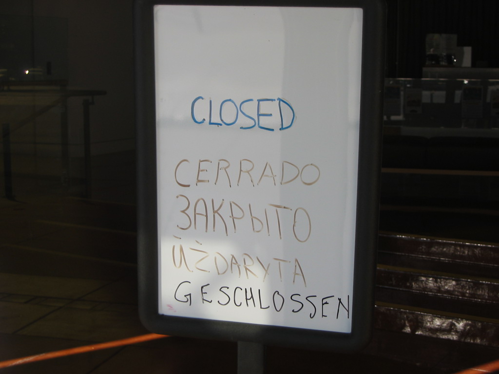
Clearly the staff here are problem-solving as they go along, as there must be many visitors to this visitor center who don't read "Closed." But perhaps it's time for a real sign?
I agree with Seth, any time you see a hand-made sign, you are looking at a customer experience that is broken.
Tip of the day: If you are in management, look around for signs that your employees have made. Use that opportunity to discuss the underlying problem, then empower your staff to fix it.
Technorati Tags: customer experience, customer service, signage, Seth Godin
Subscribe to:
Posts (Atom)


