Showing posts with label visitor experience. Show all posts

Visitor experience at Conner Prairie Interactive History Park

I had the pleasure of making a field trip Conner Prairie, famous for its living history, which recently changed its name from a museum to an "interactive history park." I was curious to see if the newer style of interpretation, as shown in their CD-ROM Opening Doors, was as effective as I'd heard. This post will cover the first person interpretation, done mainly in the section called Prairietown. The buildings are not original to the site, but are all old buildings moved from other locations in Indiana.
Everyone you see in this area is in period attire, unless a staff member has entered from another area. But they still don't break character. Here's a short clip, including one amazing volunteer named Iris O'Donnell who is 12.

In the doctor's house... apothecary items made from their garden.
Handbills outside buildings tell changing stories.
A room at the Golden Eagle Inn, where you learn that you would share this bed.
Kitties are part of the story, and probably offer vector control as well.
Toys invite kids to jump in and play.
Here are the invites for the daily party, which visitors can help write out or take with them.
I loved how everything was touchable and nearly all the buildings were staffed, had fires going, and had food cooking. It was a truly remarkable museum experience! More in another post about some other aspects of the Conner Prairie visitor experience.

Visitor experience tips from a high-end grocery store


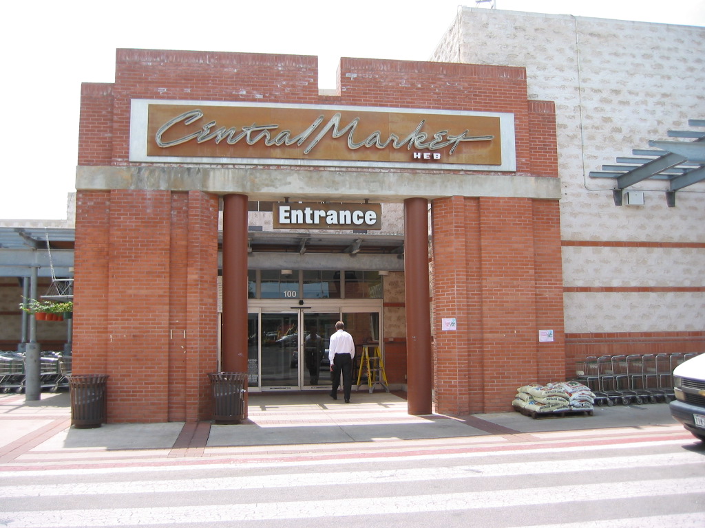
I first wrote about Central Market, in Austin, TX four years ago. It's an upscale grocery store on steroids. The store is arranged in enclosed sections; as you walk through you feel like you are discovering new stores within a store. A fabulous take-out cafe. Incredible flowers. Amazing produce. Bulk foods that go on for aisles. While I was intrigued, I told myself, “I’ve seen this stuff before. They just have more of it.” If you're a museum that has very similar exhibits to other museums in your category (science center, children's museum, natural history museum), read on to learn how this store wowed me.

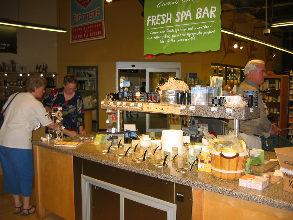
And then I found the Fresh Spa Bar.

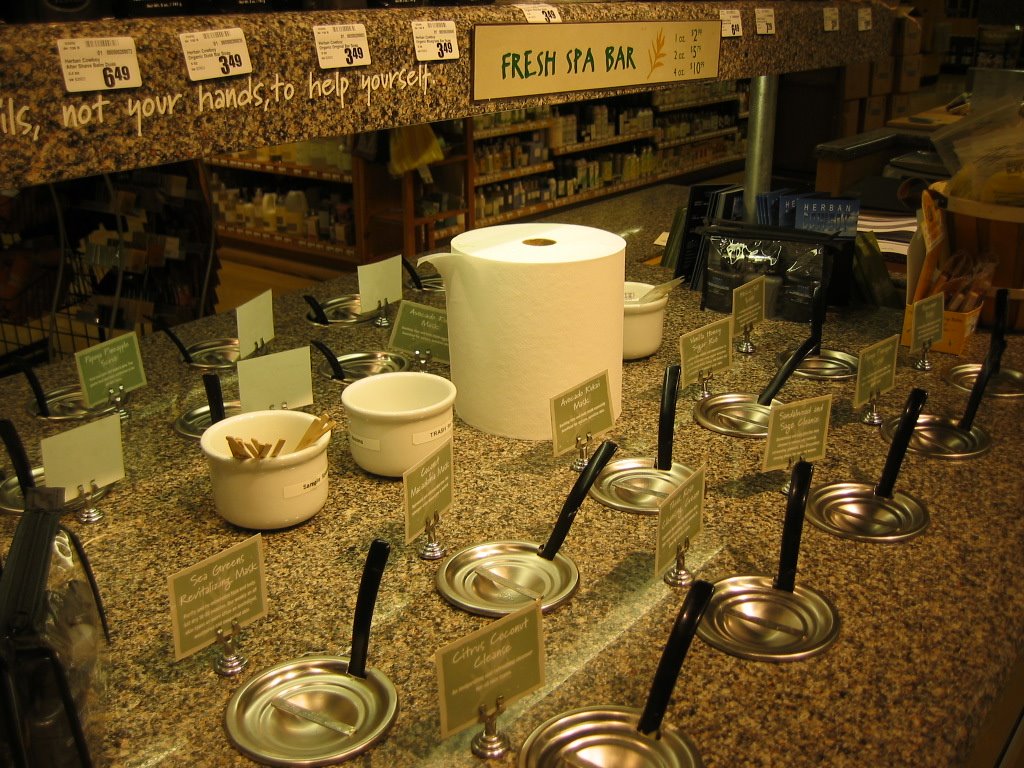
It’s set up like a salad bar, with chilled pots of moisturizers, masques, foot polishes, and sugar scrubs. It smelled heavenly and luxurious, and the chilled cart reinforced that everything was freshly concocted. How could you take a "typical" exhibit and give it a twist that sets it apart?

I could choose a cute one-ounce pot of anything for $2.99, stick on the label, and fill it up. Now, I don’t usually buy anything that costs $48 per pound! But at that moment I wasn’t interested in doing the math; this was fun and special. Even though I didn’t need anything, it was sweltering outside, and I was getting on a plane, I mixed up three containers, and then continued shopping.

Some Central Market staff members, called Foodies, are encouraged to open any product for a taste, and it’s one of the most popular tourist attractions in Austin. They got me excited about spending $25, because the experience was so enchanting, so different. Note that this grocery store is one of the most popular tourist attractions in Austin! This is your competition, museum people!

This is an excerpt from Creating Great Visitor Experiences: A Guide for Museums, Parks, Zoos, Gardens, and Libraries. Thanks to Kevin Blessing, General Manager of the North Lamar store, for the interview and permission to use photos.

Custom retail products enhance the visitor experience

I had the opportunity to attend the Association of Partners for Public Lands conference when it was held in San Diego Feb 7-10, 2010. In the big exhibit hall, one vendor stood out. They went through the hassle of working with the teamsters to bring in this awesome Airstream trailer as the focal point for their booth.

The Airstream perfectly captures the spirit of adventure that their products showcase, custom artwork in the spirit of the WPA posters of the 1930s and early 1940s. They have also been painstakingly re-creating and restoring as many of the original WPA posters as they can locate (only about a tenth of the 35,000 designs have survived).

It also allowed them a space to bring potential customers in to sit and chat, a rarity at trade shows.

They can do custom artwork in the WPA style for historic sites, like this beautiful card for Saguaro National Monument. (They are primarily focusing on parks, but do contact them if you have a historic site and are interested in custom products in this style.)

This merchandise embodies the authenticity trend that's been so strong in the last few years. The card stock is high quality and the overall effect is beautiful.

Check out their website for more information.

The visitor experience at Madrid Barajas Airport

Travel with me to Madrid's international airport in this 4-minute video podcast.

I examine the visitor experience at Madrid's Barajas International Airport during a LONG layover, including wayfinding, retail display, family-friendly touches, and comfort elements like seating. You'll learn why we ended up at the wine bar more than once. (Hint: it wasn't the wine.)

Experienceology hits Main Street: Coldwater, MI wins free book!

I wrote an article for the National Trust's Main Street Foundation publication Main Street News. At the end of the article, we gave away a free copy of my book Creating Great Visitor Experiences: A Guide for Museums, Parks, Zoos, Gardens, and Libraries. The winner had to submit an entry for my blog. Here it is—from Barb Rosene, the Executive Director of Coldwater Michigan's Downtown Development Association:

Downtown Coldwater has been making great strides to create a better experience for all who visit. We offer free wireless Internet access throughout the entire downtown. For over 10 years the City of Coldwater has had its own broadband internet and cable television network, so it was quite easy to get the routers and have them installed throughout the downtown. The cost to the Coldwater Downtown Development Authority is $2,500 a year. This has proven to be a great service and well received.

The Downtown Coldwater Historic One-, Three- and Five-Mile Walking Tours have been a great asset, encouraging all to get out and exercise more. A brochure is available with routes as well as a description of 40+ historic sites along the way, available at downtown locations and the Visitor Bureau's website. Our new DDA website will have the printable brochure as well.

Keeping the downtown area clean, safe and attractive is always a struggle. Flowers are planted and cared for by area garden clubs and individuals. Here are some of the flower displays in front of North Woods Coffee Company. (All photos courtesy of Barb Rosene.)

We have worked very hard to introduce the many varied art forms this community has to offer. Art Walk is on the first Fridays in May and October—visitors can go into 12-15 different businesses, view the art, and have light refreshments. We also have an Art At the Park each year featuring juried art which has been very well received.

Also each Tuesday in July we have Entertainment Under the Stars featuring local bands—folk, blues, swing, rock and roll, and dixieland—with large crowds attending. Here is performer Jim Stout.

Thanks Barb!

Want to win your own signed copy of Creating Great Visitor Experiences? Send me an entry describing an experience you've created, or one you feel deserves recognition. Include 3-5 pictures and a description I can use in my blog. I'll choose the winner from all entries received by September 30, 2007. Experiences from any type of location, nonprofit or for-profit, are welcome.

Technorati Tags: , , , , ,

Lessons from exhibit halls, part 2

In part one of this series, I showed some successful trade show booths from the American Association of Museums conference in Chicago. I just attended NeoConXpress, a design showcase in L.A. In this post I'll show some less-successful examples of booth design (or execution) with the eye to helping you improve your experience. As I'm trying to teach, not embarrass, I've hidden the company names or identifiers.

There is so much happening in this booth that I don't know where to look or what to focus on. The result in a busy exhibit hall? I move on.

This booth is confusing because the King Tut print is a giveaway, having nothing to do with the work this company does.

This booth is felled, not by design, but by the mess the sales rep has created.

It's common to want to stuff as much printed material onto a table as possible. Instead, consider how to make an impact with less. Can you offer these pieces as downloads on your website? Think of the paper, printing, shipping, and waste you would eliminate. (The exception is if you are selling books or pamphlets. but still consider how to reduce clutter.)

This booth is a little cluttered, but the real problem is the table visually blocking access. If you need a surface to work or offer handouts, put it against the side to open up your space.

We've gone from too many messages to no message at all.

Finally, I thought it was amusing that their tag line is "human design," but there is only a dog in the photo.

Tips of the day: Design from across the room. Design walking by. Have one clear message and make sure everything in the booth supports it. Consider what you yourself do with handouts and other giveaways; plan accordingly to eliminate waste and reduce the environmental impact.

Technorati Tags: , , , , , , ,

Lessons from exhibit halls: part 1

These are the last of my photos from my Chicago trip in May to the American Association of Museums annual conference. Exhibit halls, especially one this size (over 1,000 booth spaces) are a microcosm of experience design. Let's take a look at some successful ones.

In a big hall with so much visual stimulation, booths have to have a clean, simple, clear message from quite a distance away. This one features incredibly life-like mannequins. (The woman in the blue shirt is real.) My suggestions to improve this booth: Cover the entire back of the booth with black. Skirt the table in black. Simplify the sign by removing 2/3 of the text. Let the figures speak for themselves, as they are compelling. Provide simple, clean takeaway literature.

This is a nice example of clean graphics tied in with a themed giveaway (packets of wasabi peas). Just make sure your giveaway (if it gets home), really carries your core message.

People give away lots of junk in exhibit halls. These were fun ribbons you could add to your name badge, with sayings like "cool scientist" and "rock on." Again, just make sure your giveaway carries your core message once people leave the booth.

This booth for exhibit riggers/fine art installers Methods and Materials was my favorite. The booth actually told a story of "installation" and the guys working it were essentially in costume. I walked away knowing what they did, and that they are creative and pay attention to detail.

Tips of the day: Design your booth from 50 feet away. Create the entire space; don't depend on the backdrop that is given you. Theme everything, but keep it simple. Giveaways need to work once they leave the exhibit hall.

Technorati Tags: , , , , , ,

Creating the Dead Sea Scrolls visitor experience

I was honored to join the team at the San Diego Natural History Museum to help develop the Dead Sea Scrolls exhibition, open from June 29-December 31, 2007. This post also features some of the amazing partners who helped make the experience so special for visitors. The exhibition is co-sponsored by the Israel Antiquities Authority and the Dead Sea Scrolls Foundation and features pieces loaned from the Department of Antiquities of Jordan, The National Library of Russia, The British Library, Hill Museum and Manuscript Library, The Saint John's Bible Project, and the San Diego Public Library/Wangenheim Rare Book Room.

Some of our goals as a team:
• creating an exhibit experience that puts the scrolls in context, both in time and in place
• take people on a journey to Israel
• show the similarities in climate and geography between San Diego and Israel
• tell the story of the scrolls’ discovery and conservation
• give people a feel for the nearby archeological site—Qumran—as we were showing many objects found at that site
• present the show in a way that allowed people of differing faiths and belief systems to feel comfortable
• explore how the ideas represented in the scrolls have influenced the world over the last 2,000 years

Here is one of the comparison photo pairs from the queue area before you enter the show. The flip-up label below each pair asks the question, "Israel or San Diego?" The educational panel on the right compares Israel and San Diego as biodiversity hotspots. The photo show, in the first gallery, features Israeli photographers Duby Tal, Neil Folberg, and Yossi Eshbol.

This is the introduction about the discovery of the scrolls. Next to the cave is the Bedouin man who first found the scrolls. His first-hand account is quoted to the right. My thanks to Jim Trever for sharing his father's wonderful photographs with us.

One of my favorite characters in the scrolls story was Kando, a Arab antiquities dealer. With the help of the Allegro Archives at the Manchester Museum we were able to find this wonderful photo of him outside his shop (he's in the center, wearing the fez), and then created a rustic display case to show some of the actual boxes and tins that held scroll fragments. Thanks to the Old Coin Shop for donating three period-appropriate coins to dress this case.

A scaled-down replica of the archeologists' tent (custom-made by Tentsmiths based on photographs) helped create the feeling that you are there. The rustic cases, all built by the carpentry wizards in the museum's exhibits department, show the actual camera, baskets, surveying equipment, and hand-painted topographic plans from the dig (on loan from the Ecole Biblique in Jerusalem). The plans were scanned at full size by the team at Giant Photo, laminated, and put out on the table for visitors to look at more closely. The wonderful photograph, also from the Ecole, shows members of the team having a midday meal. Giant Photo did an amazing job printing and mounting the photos and panels for this entire show, all 12,500 SF of it!

The biggest challenges for me as an exhibit developer/storyteller:
• Sifting through the many versions of the stories
• How to present religious documents without doing a show about religion itself
• Creating a show where, regardless of their interests—religion, science, archeology, history, art or culture—a visitor would feel welcome.

It was challenging material. Once you start reading about the scrolls, it’s clear that no one agrees about them! For example, you might think it’s straightforward to report who found them and when they were found. But, every telling of the discovery is somewhat different. Were they found by accident by a shepherd boy or quite deliberately by a Bedouin relic hunter? Were they found in 1945 and hung in a tent for two years or found in 1947 and taken to Bethlehem right away to be sold? We weighed all the information carefully and then worked on writing the panels to reflect the unknowns.

Another source of controversy is: Where did the scrolls come from? While many scholars and archeologists believe the scrolls were connected to the nearby site of Qumran, there are nearly as many who believe they were brought from Jerusalem to protect them from the invading Romans. Some of these scholars can get pretty fired up about their theories.

We decided as a team early on to try to have the people in the story tell the story, using first-person quotes throughout the entire experience. The educational panels make it clear throughout the show that there are conflicting theories, and that we will never know for certain who wrote the scrolls, who hid them, and why.

At the end of the experience we ask visitors, “What do the Dead Sea Scrolls mean to you?” Their comment cards are collected and become part of the exhibit experience for others to read. This "talk-back" area also features a gorgeous sculpture called My Torah by modern artist Becky Guttin.

I hope that you will take a trip to San Diego to see this amazing show. I’m very proud of the end result and was honored to work with such amazing people on the design and content team and it’s gratifying for the show to be getting nice reviews and very positive visitor comments. I would like to thank the team at the museum for allowing me to be part of their world for a year, as well as the many, many people who contributed resources to make the show so special. If I didn't mention you here, please know that we appreciate your contributions!

Technorati Tags: , , , ,

A family-friendly 4th of July

We had a great time visiting this local park, an alternative to the crowded beaches.

One of the highlights was the parade, including a horse and carriage and a band.

Costumed interpreters helped kids make crafts like old-fashioned bunting.

These battlefield reenactors shot off the cannon every hour.


Tip of the day: Special programs can bring your site to life. Adding crafts, music, food, and other activities, especially people in costume, makes for a memorable event.

Technorati Tags: , , , , ,

A self-proclaimed "experiential faux pas"

From a reader who will remain anonymous:
"Yes, I know your eight steps.
Yes, I know this is bad, bad museum practice... bad practice in general for any business anywhere.

But it's Memorial Day. I don't have enough staff and volunteers to watch these areas and I'm tired of walking through every hour (if I get a chance) and asking people to get out of the water.

Our printer is not working and there's no chance of getting it repaired. Our phones are out so I cannot call another department to use their printer—and they're all out on holiday anyway.

And so I commit the sin. I hand-write the signs and put them up.

At this point it's about MY experience not theirs!"

Dear reader, thanks for sharing. We've all been there, believe me. And I know that visitors will do the craziest things in gardens.

When I look at these signs, (nice handwriting, by the way) my first thought is: this is a design problem. Because the area is an experiential garden, and there are lots of things to touch (and probably things meant to climb) and so it's confusing for the visitors to know which things are off-limits. I'm wondering if there could have been ways to design this to either create clearer barriers or allow the kind of climbing and wading that visitors clearly want to do.

Any designers out there want to comment, for people who are still in the building or planning stage?

Technorati Tags: , , , , ,

Do people care about "customer experience" yet?

No, not according to Google Trends.

Google Trends is a cool new feature pointed out by MannyMo's blog. You can compare the volume of searches for any two terms since 2004. The red bar represents searches for "customer service." The flat blue line (appearing only in 2005) represents searches for the term "customer experience." So, despite the success of The Experience Economy in 1999, and people like Mark Hurst, who have been teaching about customer experience for ten years, it's still flatlined out there in the Google consciousness.

Why? Well, for one thing, the term customer experience got appropriated by a very specific, narrow set of parameters in business called CEM, for customer experience management, which focuses mainly on improving the performance of call centers. I have a Google news feed set up to fetch articles including the term customer experience; for the last six months it's netted only press releases from companies or consultants focusing on CEM.

A search on Amazon gave me 41,488 books tagged "customer service" and only 3,147 books on "customer experience." So, believe it or not, we're still on the leading edge of this discussion. There's still a lot of room for fresh ways of looking at the customer experience, from Danny Meyer's book Setting the Table (reviewed here) to Jonathan Tisch and Karl Weber's new book, Chocolates on the Pillow Aren't Enough.

Why do you think the concept of customer experience still seems "new?"
Technorati Tags: , , ,

Reactive or proactive customer service: What's the difference?

I recently completed a series on defining the term customer experience. The series sprang from a discussion on my first podcast with Susan Abbott, where we discussed it in more detail.

An article in yesterday's paper added another layer to this discussion that I wanted to share. The article featured a new hotel in San Diego that is training, in the English style, a dozen butlers to offer customized service to their high-end clientele.

The item that struck me was the trainer's quote, "Most hospitality service is reactive, not proactive." He goes on to talk about how a good butler might notice that a guest had eaten all the black jellybeans out of the bowl, and could then replace them with all black jellybeans while the guest was out, thereby anticipating a need or desire. Photo by Laura Embry/Union-Tribune

Reactive vs. proactive is another way of framing the discussion about customer experience, too. Reactive is equivalent to removing the irritants for customers, reducing their complaints, and thereby improving their experience. But in some ways it's too late, because they've already had a problem that you are now trying to fix.

Proactive is going far beyond that, being ahead of the customer in a sense, reading their cues, designing and developing aspects that will wow and delight them. If someone noticed my jelly bean preferences and responded to them in that way, I would certainly tell people about it and be more likely to want to return.

Tip of the day: Proactive is better. Figure out how you can step ahead of your customer's wants and needs to surprise them, rather than just responding to complaints. Your number of complaints will probably lessen as well!

Technorati Tags: , ,,

Customer experience definitions: The finale

To wrap up this series on defining the customer experience, I’d like to synthesize some of the notable aspects of the posts here and on the other blogs (listed below in the order they appeared in the original posts).

I started out by sharing a short version of my definition of customer experience as being inside/outside. Inside the customer are all their thoughts, feelings, and emotions. As Adam pointed out, a customer’s feelings and emotions can be greatly influenced, especially through theatrical techniques (and the consumer psychology persuasion techniques that make up most marketing strategies today). Marianna gave a lovely explanation of this influencing technique by suggesting that we need to define what kind of experience we are trying to achieve, i.e. are you selling confidence, success, rejuvenation, excitement, or peace of mind? Helene thinks that we are trying to help customers feel good about themselves, while Pamela suggested we are trying to seduce customers into buying.

Outside the customer is the designed experience, every aspect of our environments, processes, and products. Becky provided a cradle-to-the-grave metaphor to illustrate the completeness of how we should be approaching our customer relationship, which reminds me both of the lifetime-value-of-a-customer work of Peppers and Rogers (no accident that she used to work with them) and of the South Bark Dog Wash here in San Diego, who want to serve customers for the entire life of a pet.

While Susan has a more complete description of this outside approach than simply “removing irritants” (which is just the part of our podcast conversation I quoted), several people noted that while removing irritants was important it didn’t go far enough. Mark’s “efficiency” concept (indicating a well-run experience) ties in here, but note that he also includes "aesthetics" (design) and "meaning" (emotions) as necessary for a complete experience.

Sara also talked about design: designing a positive peak and a positive ending to the experience. This positive ending ties in with Adam’s comment about the experience lasting after they’ve left your business, as he thinks we should be creating memories and using memorabilia to create lasting impressions.

And I certainly agree, the last step of my 8-step process is the Finale, and I have an entire chapter in my new book devoted to the importance of creating a great last impression and choosing memorabilia for impact and what psychologists call "place attachment.” C.B.’s post about walking in her shoes adds another way of looking at designing the full experience and thinking through every single aspect of what you offer.

Tip of the day: Recognize first that you aren’t selling products, culture, or services, you are trying to influence people. Fixing what’s broken or irritating people is a great first step. Stepping back and looking at what kind of experience you are trying to achieve might be next. Going through each aspect of your experience as if you are the customer will help pinpoint where you can improve. And, designing or re-designing elements to evoke an emotional response and create memories might be the highest level of customer experience we can create.

Thanks to all the bloggers who participated!

Read the posts in order:
Part 1
Part 2
Part 3
Part 4
Part 5

Technorati Tags: , , ,

Defining "customer experience," part 4

Today's definition of the term "customer experience" comes from Becky Carroll, of Customers Rock! For more definitions, read part 1, part 2, and part 3.

"The customer experience encompasses all aspects of a customer's interaction with us. It spans the sales, the packaging, the 'out of box' experience (opening the product), the registration and installation/set-up, the usage, and the ongoing maintenance of the product or service (think PCs).

Or, in retail, it spans the in-store experience of the shelf displays, the size of the aisles, the crazy wheels on the shopping cart, the employees, the restrooms, the check-out lines and clerks, and the ease of returns.

In service, it spans the sales, the installation, the usage, the subscription, the monthly bills, and the upgrades (think cable/satellite TV). Take a moment now and think of what this looks like for your company and your industry!


In a nutshell, I believe the customer experience is a cradle-to-grave experience with a product or service. Not from a 'life' perspective, but from the life that customer has with that product or service." You can read Becky's full post here.

And, for a great post on cool customer experiences, visit Orange Slices, a library blog from Florida. This post makes me want to get on a plane to New York immediately to check out this Samsung store!

I'd also encourage you to read the comments on these posts, as people are offering some great additional information. Listen to my podcast with Susan Abbott, where we delve into this topic in depth.

Technorati Tags: , ,

Defining "customer experience," part 3

Today's response to my previous posts, part 1 and part 2, comes from Sara Cantor, of The Curious Shopper, one of my favorite blogs.

"I read your post and I think the inside-outside framework is very interesting. Surely most companies focus on the outside, and assume that this will have a direct impact on the inside. I think it's smart to separate them, to remind companies that they can't always control the inside, but that they can at least study the relationship between the two.

My take on customer experience is related to a principle of all experiences: their impact depends on two points, the peak and the end. I believe this theory was first shared in The Experience Economy by Pine and Gilmore (one of my favorite books). An experience always has a peak, be it positive or negative, and it obviously has an end. It's the biggest drop on the roller coaster, and how you felt when you walked off the ride.

In retail, an experience will be defined in the mind of the shopper by these two points as well. The peak is either the high point, when you try it on and it looks great, or the low point, when you discover they don't have your size. The end is when you are given a nice "Thank you" as you leave, or when you walk out without a receipt because the salesperson was taking too long. Retailers should focus on designing both a positive peak and a positive end. And hey, the peak might not be totally in their control, but the end almost certainly is. Perhaps stores could start by defining some "ideal peaks" and some "ideal ends," as well as listing the negative peaks and ends that they'd like to avoid."

And, check out this great post on good experiences by Pamela Slim of Escape from Cubicle Nation. You can listen to my podcast interview of Susan Abbott for a more thorough discussion of this topic.

What do you think? Post your comment by clicking "comments" below.

Technorati Tags: , , , , ,

Jewel on the marsh: Chula Vista Nature Center

Chula Vista, California: Last week our local museum networking group, the San Diego Evaluators and Exhibits Group, met at the Chula Vista Nature Center. While I've been in San Diego for ten years now, I hadn't been done to CVNC in nearly that long. What a fantastic experience!

Here's what they did well. The building, which is on Federal land in the saltwater marsh, is reached by natural-gas powered shuttle bus. We got a warm greeting from the driver, several eco-messages, and the feeling of going on a special journey. The building is designed to evoke "boat house" and looks comfortable on its site.

The animals' enclosures were spotless and everything looked incredibly healthy. CVNC is one of only four nature centers in the U.S. that is accredited by the American Association of Museums; it was the first. Some highlights were this exhibit panel in the shark and ray exhibition explaining why we shouldn't dump pollutants into storm drains. If you drop a coin into the "storm drain" it rolls downhill and ends up in the fish's mouth. (Shout-out here to artist extraordinaire Jim Melli of the San Diego Natural History Museum who did the watercolors and the bronzes for CVNC.)

Outdoors, you can meet a coyote (life-size, also by Melli) and learn about their role in the habitat.

Kids no taller than that blue sign in the back (darn!) can climb in the marsh bird's nest and feel how it floats.

Animals were displayed in enclosures built into large photos of their native habitat. All signs were bilingual (English/Spanish) with each having its own color, but equivalent size/weight fonts.

Recycled benches were topped with tiled mosaics, tying them into the content as well as upgrading the look.

At $6 per adult, it's an incredible deal. And I haven't even walked out into the marsh yet! I'm looking forward to going back and spending some time there.

Tip of the day: I've said it before, but attention to detail is key. The only negative aspect of this experience is at the beginning, as the parking lot and shuttle stop are not ideal. (Neither are under the control of CVNC.) Executing your details with artistry, and caring deeply about your subject matter, create a feeling of quality that sets you apart.

Technorati Tags: , , , ,

"Everything speaks" at Tijuana Estuary Reserve

Imperial Beach, California: Last weekend I spoke to the new docents at the Tijuana Estuary National Marine Research Reserve. This park is a joint venture between California State Parks and a number of other state and Federal agencies to study and preserve a rare habitat in Southern California. The visitor center was lovely and I'm looking forward to going back and hiking around the trails. I'm going to highlight some of the ways that attention to detail enhanced this experience.

The phrase "Everything speaks" comes from the Disney Institute's great book, Be Our Guest. They describe how fanatical attention to detail, what author Seth Godin calls vernacular, helps create a seamless impression of quality.

The visitor center is beautifully integrated into the landscape, and welcomes you in. (Inset is the entry panel at the parking area.)

A floor map that begins outside the door gives a visual of the size of the watershed, maps the area, and can be used as a teaching tool. Best of all, in my view, is its artistry. (Inset shows one of the circles that indicate place names. The line of pebbles is the U.S./Mexico border.)

An interactive exhibit inside teaches through trial and error how the size of the bird's beak determines what kind of food they eat. When you put the beak into a hole in the "mud flat", the black bar will light up with the type of food. Deeper holes (and their corresponding food) can only be reached by long thin beaks. I've seen this content many times; this is the most memorable interactive I've seen. (Inset on right shows the full light-up panel.)

After I finished my presentation, I walked out into the foyer, where the docents and staff were busily re-arranging the front desk to make a better first impression. They pulled out this table to display some of their printed matter that had been cluttering the front desk. Instant gratification for yours truly, seeing Experienceology put to work!

On our way out, I had to get a picture of this utility box, depicting local bird life. Great way to tie in and beautify a necessary component of the hardscape.

Tip of the day: Taking the extra time to add artistic elements elevates your experience. Pull in artists from your community to add touches to your building that bring it to life. Think through all the details that enhance your experience, and take a fresh look at your first impression. Simple changes can make an enormous difference and don't have to cost a thing.

Technorati Tags: , , , , ,
Related Posts Plugin for WordPress, Blogger...